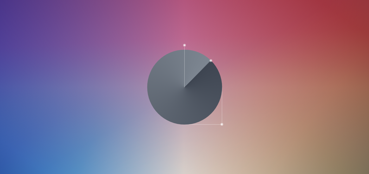
Gradients
Learn how to create elements of the image data type that show a transition between two or more colors.
Learn how to create elements of the image data type that show a transition between two or more colors.

The linear-gradient() function gradually produces a color transition with two or more colors. It accepts a number of arguments, but in its most basic form, you can simply pass some colors and it will automatically split and blend them.
Let’s see the syntax:
.linear {
  background: linear-gradient(#ffb074, #ff5353, #6050ff);
}
You can add an angle with keywords, like to right that represent an angle or use degrees, like 45deg.
.linear {
  background: linear-gradient(to right, #ffb074, #ff5353, #6050ff);
  background: linear-gradient(45deg, #ffb074, #ff5353, #6050ff);
}
You can also add a color stop value defined where a color stops and mixes with its neighbors, so it start where you want it to, like 40%.
.linear {
  background: linear-gradient(to left top, #ffb074, #ff5353 40%, #6050ff);
}
The radial-gradient() function gradually produces a color transition with two or more colors in a circular fashion.
In its simplest form, you can just pass some pre-defiend color names, and it will automatically split and transition them. However, it accepts a number of arguments.
Let’s see the syntax:
.radial{
  background: radial-gradient(#ffb074, #ff5353, #6050ff);
}
You can change gradient’s shape to a circle.
.radial{
  background: radial-gradient(circle, #ffb074, #ff5353, #6050ff);
}
You can also change ‘fade ends’ of the gradient with these values: closest-corner, closest-side, farthest-corner, and farthest-side.
.radial{
  background: radial-gradient(circle closest-side, #ffb074, #ff5353 40%, #6050ff);
}
You can also change ‘starting point’ of the gradient with these values: closest-corner, closest-side, farthest-corner, and farthest-side.
.radial{
  background: radial-gradient(circle at top right, #ffb074, #ff5353 40%, #6050ff);
}
A conic-gradient() is similar to a radial gradient. Both are circular and use the center of the element as the source point for color stops. However, in conic gradient colors transition themselves around the circle.
Let’s see the syntax:
.conic {
  background: conic-gradient(#ffb074, #ff5353, #6050ff);
}
You can change the point of the color transition with keyword at followed by percentage ‘coordinates’ like at 25% 75%.
.conic{
  background: conic-gradient(at 25% 75%, #ffb074, #ff5353, #6050ff);
}
You can modify the angle of the start color with degrees, like from 45deg.
.conic{
  background: conic-gradient(from 45deg, #ffb074, #ff5353, #6050ff);
}
Every gradient type also comes in a repeating version. You can use the functions repeating-linear-gradient(), repeating-radial-gradient(), and repeating-conic-gradient().
They accept the same arguments as the non-repeating functions and are similar to them. The distinction is that, depending on both of their sizes, the defined gradient will fill the box if it can be repeated.
See the syntax:
.repeating-linear {
  background: repeating-linear-gradient(45deg, #ffb074, #ffb074 32px, #ff5353 32px, #ff5353 64px, #6050ff 64px, #6050ff 96px);
}
Similar to how you would create an image in Adobe Photoshop, you can mix as many gradients as you like to get image-like results. You could combine several linear gradients, for instance, or two linear gradients with a radial gradient. Possibilities are infinite. A secret ingredients are blend-modes.
See an example:
.repeating-linear {
  background: linear-gradient(#ffb074, transparent),
              linear-gradient(to top left, #ff5353, transparent),
              linear-gradient(to top right, #6050ff, transparent);
  background-blend-mode: multiply;
}
If you you’d like learn more about blend modes, go here
I use feedback to improve UI Crux Platform. If you noticed a mistake, please report it.